
THE FARMER’S DOG
The Farmer’s Dog was created by two dog lovers to radically improve the $90 billion global pet food industry — starting with a subscription service that sends freshly-made food directly to customers’ doors. The Farmer’s Dog recently raised their Series B and are backed by early investors of Warby Parker, Dollar Shave Club, Sweetgreen, and Glossier.
THE OBJECTIVE
Once subscribed, subscription holders manage their account, order, and dog’s meal plan through this portal. Originally, the portal was intended to perform all core functions in one place. My role at The Farmer’s Dog was to reorganize the information architecture and streamline the user experience for the subscriber/account management portal.
Role: Product Designer
Collaborators: Project Manager, Sr. Product Designer, Engineering Team
Tools: Sketch, Abstract, Invision
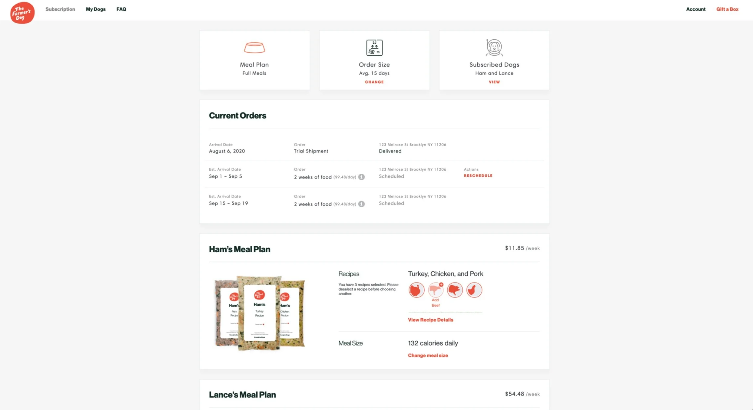
Original subscriber/account portal
THE PROCESS
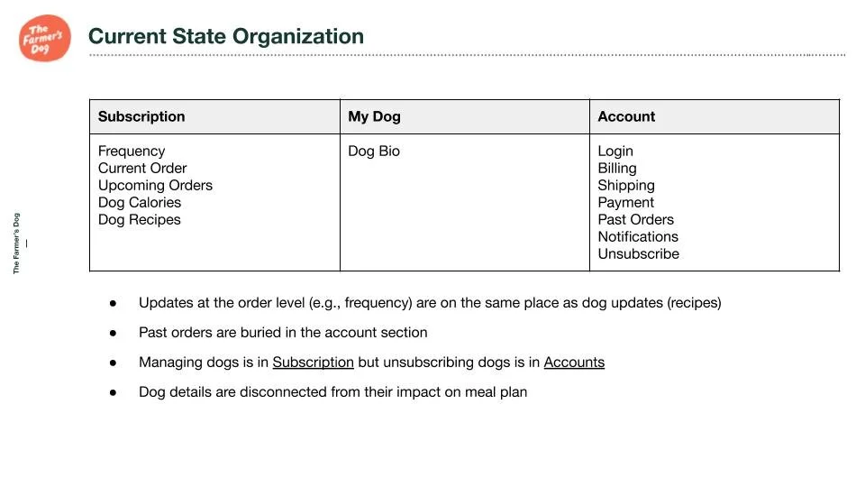
Current site organization
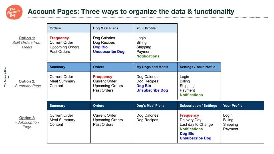
Suggested reorganization
Competitive research: Research how other subscription based services classify and organize their information, how they distinguished orders vs. subscriptions vs. account CRUD.
Identified user needs and pain points through collaboration with Customer Experience Team, User Feedback and User testing. The key takeaways are:
Commonly searched for information: Order details, Tracking, Price, Order Frequency, and if the household will have enough food for their dogs.
Must be mobile friendly.
Make navigating to your account simple and obvious.
Ground customers on which section of the site they are in.
Business ask: Maintain spotlight on Referrals as an important call-to-action.
Align with user expectations from other retail experiences.
Focus logged-in users on their accounts section.
Customers should be able to predict what content is in each section and where core actions can be taken.
From these learnings we prioritize clarifying/defining these paths. We reorganized the information architecture of the site to fit into 4 categories and pages: summary orders, my dog’s meal plan, setting/profile.
Track current order.
Reschedule Next Order.
Modify Dog’s Meal Plan.
Update shipping address.
Pause Dog’s Meal Plan.
Edit pet info.
USER TESTING
Through exploration we tested 2 different navigations and functionality. We found that the reorganization of the site was well received. The summary page was very popular with our audience. If you would like to see the prototypes please follow these links!
Desktop A /Desktop B/ Mobile 1/Mobile 2
Comments/feedback from users in the first round of user testing:
Summary Page: “It’s not what I expected but actually I really like it. It’s customized for me AND my dog. And then arrival information and what all will be there and shipping information so I don’t have to click anywhere else.”
Summary Page: “This is a very informative landing page. Besides Amazon there aren’t many pages that have all of this information in one section. We’ve got order information - tracking is pending, and how much I have, ways to edit, so I feel like everything is there.”
Meal Plan Page: “I like that it’s simple but it has a lot of good information without being overly informative or having to scroll through a lot of information, which can get confusing.”
Final View of Account Page: “So I feel like the other pages that I’ve seen coincide with this one very well. They’re all linked together in a nice orderly fashion and you can get to it in a few different ways if you prefer to navigate the website differently.You have the option to edit, current order, and some general information down here. But this top section I feel like is GOLD. It’s fantastic. I honestly wouldn’t change a thing on it. I like that it’s all neat and clean but easy to access and informative.”

Planned Summary Page
The Summary Page
The Summary page is the newest addition and a key feature in this update. Originally, subscribers land on the homepage which we intended to be a space where you can make 90% of adjustments for orders, meals, and subscribed dog.
Initially the homepage left the users feeling confused, disoriented and overwhelmed. With this in mind, the goal of the summary page is to give subscribers a quick over view of their account and direct them to other pages to manage their dog or orders.
Grounds customers on every visit to their account.
Provides an “at a glance” overview of account configuration and answers the most common customer questions.
Branded moment that feels fun, delightful, and emphasizes the simplicity and transparency offered by Farmer’s Dog.
Facilitates customer action to key account actions (either with quick links OR direct edits).
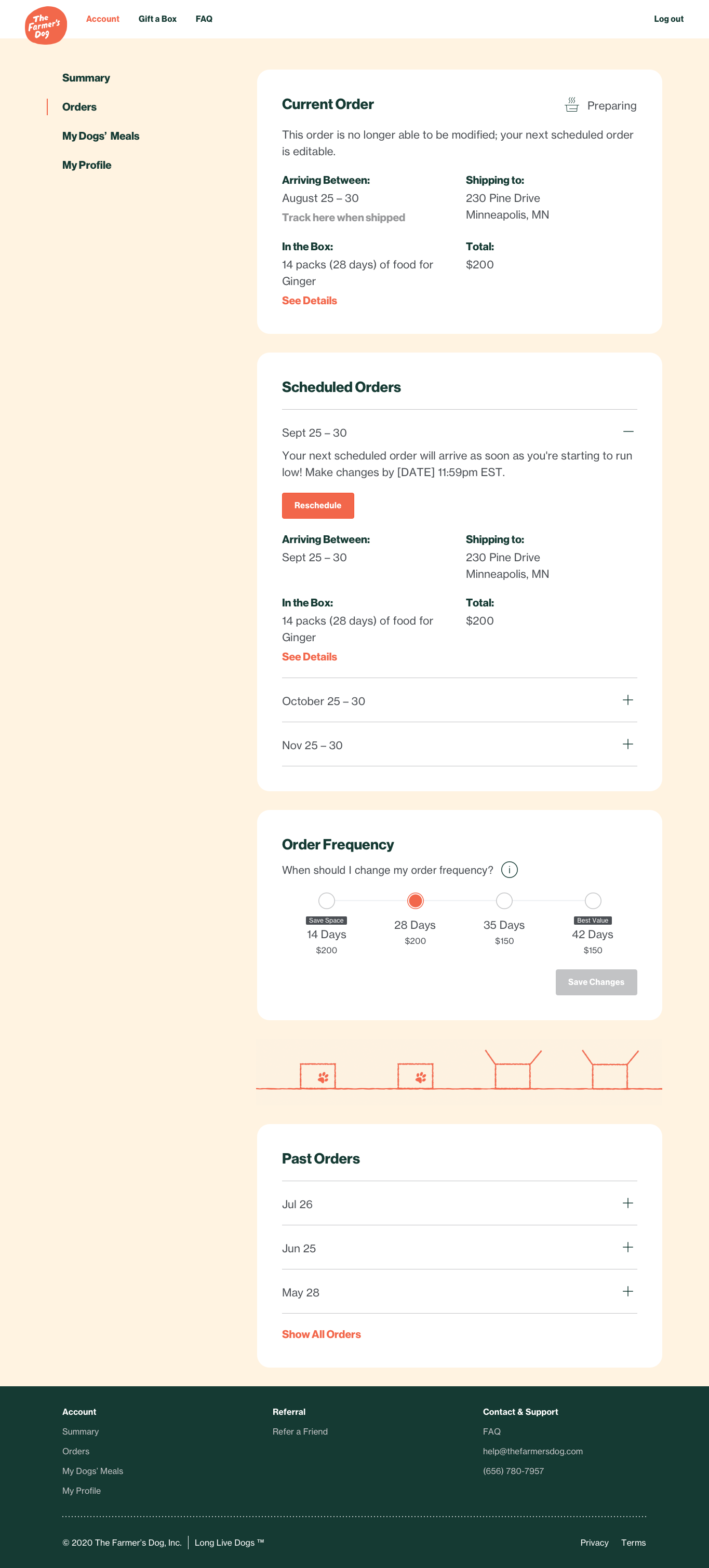
Planned Orders Page
The orders page
We have consolidated current order, scheduled (future) orders, order frequency, and past orders. Each of these sections originally lived in different parts of the user portal like editing your orders was on the home page, while your past orders live in your profile page.
The general feedback is the information was scattered through out the site making it difficult to find and distinguish information regarding your current order vs. a scheduled future order as well as finding price. With these points in mind, we determined that it would be best to keep all information regarding your order in the same space. We clarified the different states of each card section, each state the order is in (scheduled, preparing, or on its way), will determine available actions/functions (reschedule delivery/change shipping address) within each card.
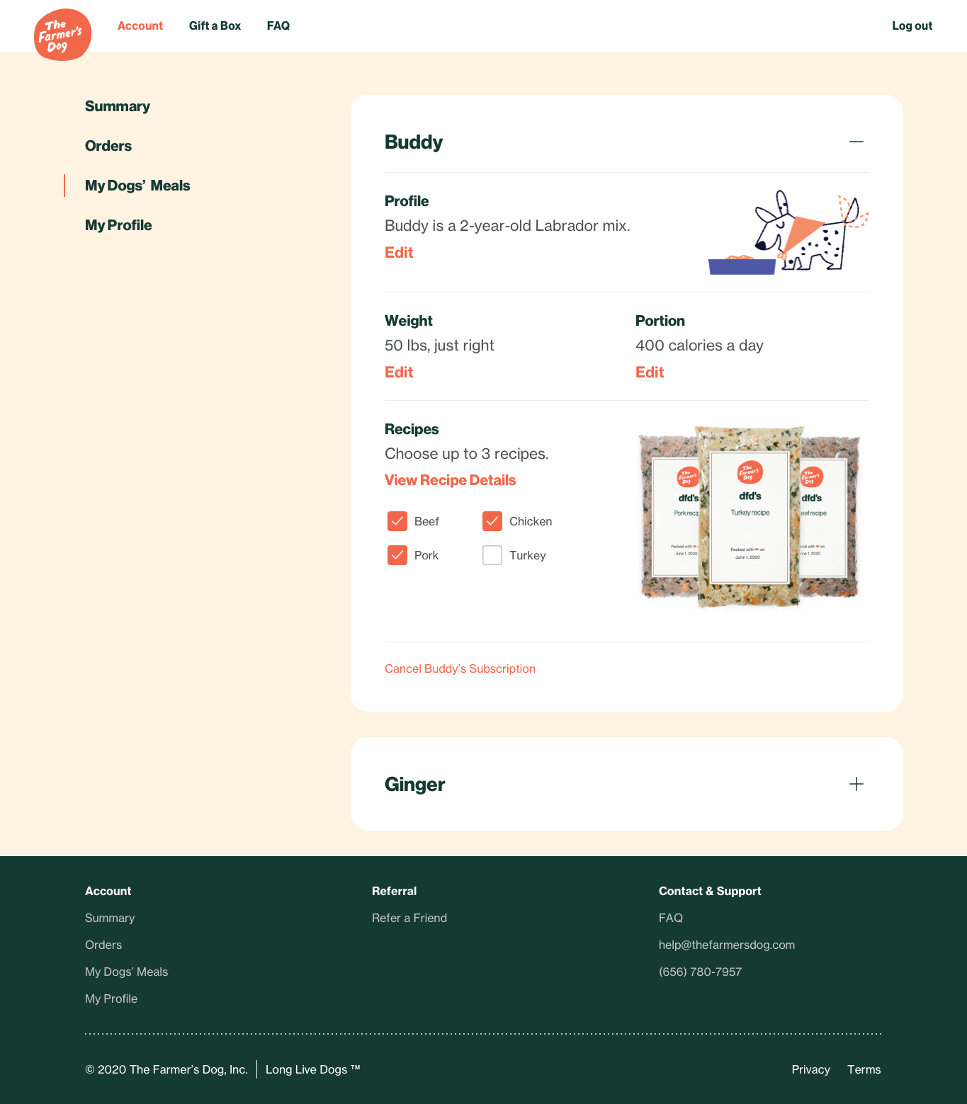
Planned Meal Page
The Meal Page
This is where the subscriber would make adjustments to their dog’s meals including: choosing recipes, adjusting portions, update your dog’s general profile information, and cancel your dogs subscription.
Like the other pages, these adjustment options were scattered across the site and the rational/organization was not clear to our users. We built upon the My Dog’s Page which was originally a page dedicated only to managing your dog’s profile information. Some of this information if adjusted will effect your dog’s meals, such as, weight and body size. We created a more robust page, where the user can see how this information relates to each other.
Scalability was a large focus on this page. How would a 3 dog household be managed without overwhelming our user and still treat each dog like a special individual? This card style accordion carried through out the site compartmentalizes each dog’s information and meal. Each dog can have personalized card which has every detail regarding their meals in one place!